

Sandwich is a concept which is started by choosing a random prompt in sharpen. I have refered feedbacks and research from a few competiting apps. Followed a UCD design process (User Centered Design). Sandwich will make the user order sandwiches through the app without spending much time to wait in a lines and pay to get the sandwich. Sandwich Has an easy payment methods and it makes users to track the order which are placed for delivery.
Info: This case study doesn’t include all the works done for the app, though it is an overview of the entire journey of sandwich app.

The targeted users are busy professionals, home makers, grand parents, students, etc,. People who has no time in their busy schedule will have benefits using sandwich, and the people who loves to hangout with friends or family might be needed an app like this.

Many people are having frustrations while waiting in the line at shops and ordering. When something is getting so long, people will usually get frustrated. The challenge is to make them order easily without spending much time in lines, to deliver food to their current locations.

Scenario: Clarke is an accountant in a professional firm. She used to get lunch out in the break time. She went to sandwich shop and noticing that ordering will be done as one by one by waiting in line. She really frustrated that she has no big time wait in the line. She is not in the will to go other shops because she thinks that it may take more time than this. She stays in the line and waited for 20 mins for her turn to come. when her order came she only had few mins left in break. She is upset and decided to take parcel and go. She left the shop without eating any.

Personas are really helping when finding a problem of user groups. User groups are set of similiar users. By doing persona it’s easy to identify the problems users face. And it led me towards thinking the solution for a specific group of users which makes the over all users experience good.


I used many tools to ideate a solution for the users problem, the tools are crazy 8s, both big-picture and close-up storyboards, sketching wireframes, paper prototypes, user flow. User flow helped me to look at the user journey through app and the screens, like decisions users take, screens users face, and the actions users does. Following i provided my user flow for the sandwich application.

Crazy eights is a fun task for me. What i followed while creating the crazy eights is, I set a timer for 10 mins for the eight boxes. It was really surprising when i finished within the time i set. while doing this my mind really thinked out of box. I felt like the shorter time makes me urge towards different and a unique solutions. I would love to use this tool when ideating.
I used to draw wireframes with a techniques and that is, I draw five screens for a single screen of the wireframe (such as HomePage). I set a timer for those fives screens like 2 mins for each instance. By drawing five screens i could easily pick the right layouts to merge to form the final screen. I have repeated process for each screens of the wireframe. And that’s how i came up with the wireframe.
Digital wireframes took only less work and it’s more useful because of its rapid iteration. Created every wireframes by standards with the shapes, lines, text. Finally created a Lo-fi prototype for the usability study to know the users need and pain points.


Mockups created with consistency and made the screen's over all flow smooth and simple. Below are the sections of the app which are briefly explained.


I started imagining about logos. I wanted the logo to be easily remembered and more appealing to users. So i decided to study the color psychologies. on my way to this i found that red is color which will induce hunger, energy. So why i gave the background red which is 70% of the screen. I wanted to highlight the cheese which is common in sandwiches. I gave the app’s name a dripping cheese illustration.
Signup screens of the most apps requires an email. I found that people phone numbers are quicker than email. Because of quickest experience i thought to get rid of emails and simply a phone number is enough for user login.
Added a map feature so that users can easily spot their address, the user not needed to remember every address they usually hangout.
And finally the home screen will come after signing up or logged in. In home users are provided with full menu and a floating action button to access the types items. In the bottom added a navigation bar to move to cart and settings. After all user successfully got in to the sandwich app.


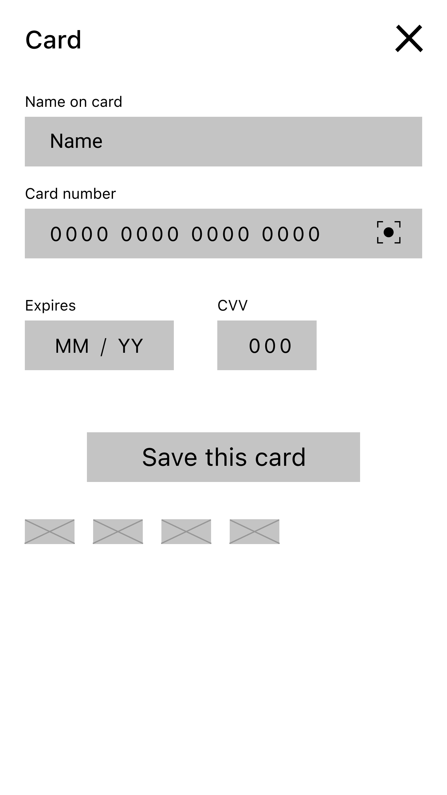
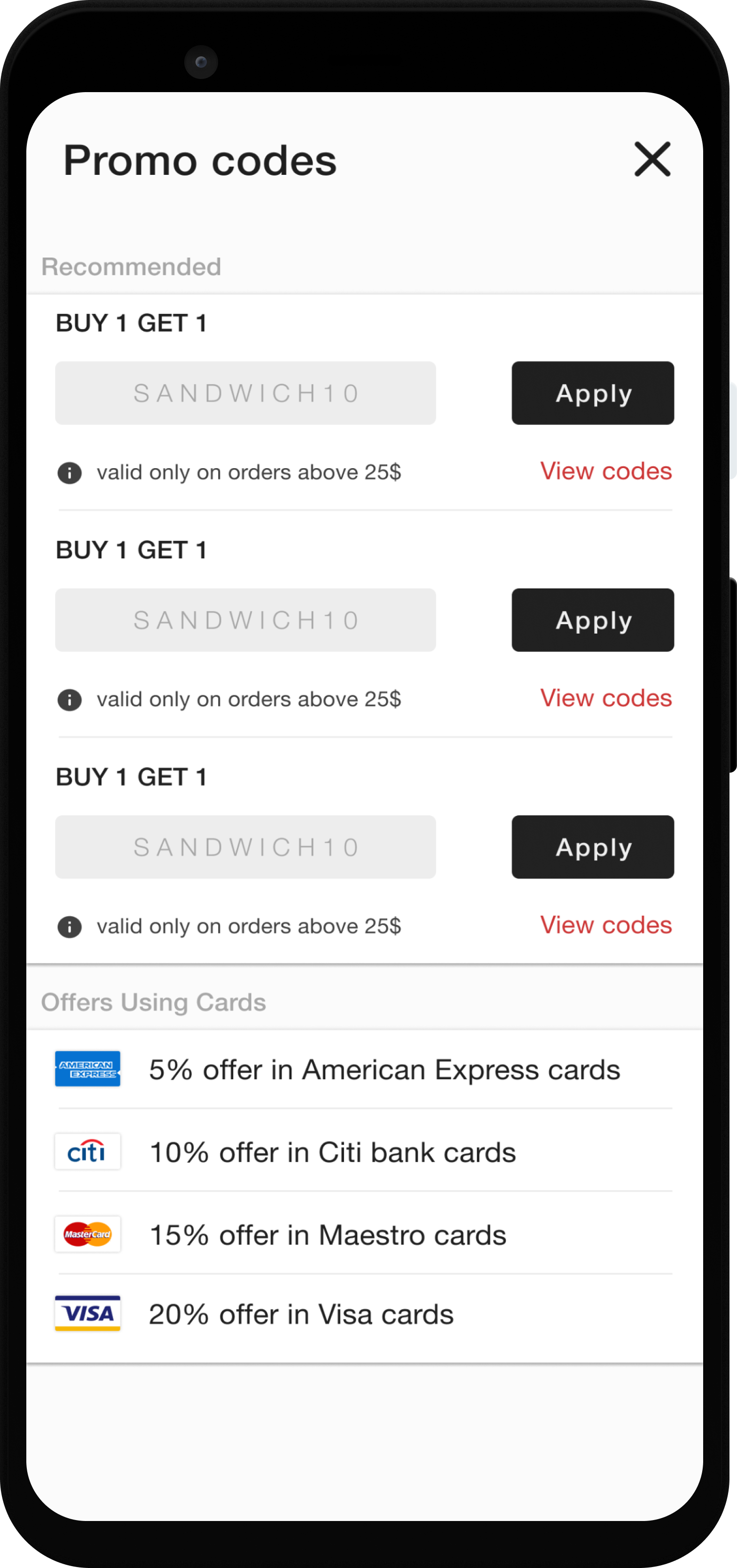
My cart is created with a clean details of the items which are added. Added a promo card section before proceed to the payment. Also included wide variety of payment methods. There is a confirmation dialog after the payment is done.


I decide to go with the present trends while doing the payments screens. Included Card payments, Netbanking payments, E-wallets, and a cash payment. This screens are familiar to nearly many apps in the market so the user might be aware of this. I’m not assuming the user i’m just saying that this screen are tested by the competitor’s and came with good user experience.


Last thing in the story is waiting for the order to come, by this time providing a tracking feature will be more effective to keep the users tension free. Map navigation of the delivering person is feels and make the app more real.


During this phase I needed to do some design critiques, usability study of the sandwich app. Unmoderated usabilty study will be the good fit for the test.
Do you live in the area with lots of sandwich shops or some snacks shop?
Do you have a favourite sandwich shop or places where u usually eat sandwich?
How many times a week you will order sandwich from the shop?
Do you usually order for yourself or for some others?
Can you talk me through a normal day in your life?


